Sunday, 16 November 2014

Hand/PC rendering of trees and shrubs practice

Hand/PC rendering of trees and shrubs practice


Please see below a selection of pieces I have produced whilst practising my plan trees and woody shrubbery symbols and rendering techniques.

This was produced in AutoCAD - exported and the shadows were added in Photoshop post completion.

Singularly they look great. When used en masse its difficult to differentiate each tree and they can look messy. Great for providing effect and presence, especially on a planting heavy plan with accent plants/ tree avenues etc.
The below image was hand created with different width pens. It took far too long and looks messy and muddled. Too much going on. 

The below image was me trying to create more basic shapes. After I decided that my trees in the hand rendered image were too complicated I wanted to create a simple selection in autocad and Photoshop. a selection that I can now use as many times as suits and will not clutter a drawing. 


 A selection of simple trees. Here I've tried using different rendering techniques. This includes sharpening a pencil onto paper and rubbing filings into the page. overall I was pleased and uploaded them into Photoshop to touch them up and cut them out to re-use.
Below is a final image I drew of a bush. I tried to make the above images more complicated and 3D. It works well but was time consuming and I don't think it suits my style on plans. 


Sunday, 9 November 2014

New Skills merging with everyday with project management

New Skills merging with everyday with project management

I am slowly finding that I have a more diverse palate and appetite for learning new skills and utilising them to become more involved at work. 

For instance the below design for a project would have previously been outsourced but now I am able to utilise my honed skill-set to help me get more involved on a base level. 

This hasn't proven to aid my profit margins but it does give me a bigger sense of pride and investment in a project. It also enables me to really steer the company to produce larger and more detailed gardens. In addition to the AutoCAD and Photoshop work I have been completing I have also been completing more and more hand sketch concepts on site which proves to be much quicker and universally beneficial for myself and the clients. 


AutoCAD documents produced and honed by me:


Here are some sketches and hand drawings for  some bespoke railings we are installing in a property in Eltham. I researched the property's period (Victorian) and tried to represent the heritage of the house whilst designing a new and interesting railing for its perimiter. In the end the first image was chosen as a design and we dropped the gate. Its now just iron panels caulked into sandstone capping on a yellow London brick wall. Photo to follow when the project is completed (estimated completion date 20th January) 


Design in everyday work and life.

Design in everyday work and life.

The more time I spend at University working on what makes good design, the more I subconsciously deliberate over objects and scenarios.

I good example of this is the recent collaboration my company and Canterbury Cathedral's blacksmith have been working on. A centre piece for a small tiered Kentish garden. Its based on a Digitalis flower and is mild steel that's been sandblasted, zinc coated and painted.

Its working on these smaller projects when I really begin to micromanage my thinking and work on what is aesthetically correct. Not be chance but by design.


Please see images below.


Chaumont Final Presentation

Chaumont Final Presentation Update;

Last week we finally completed  our group presentation.

The key things that were changed last minute included our change of mind on what wood was going to be used as shuttering for the pathway and as walling within the garden. The pricing structure also changed to bring the cost of the project down. 

Please see below the 6 A3 sheets we presented to the auditors for Chaumont. Main reason for posting is to keep a log of work completed with a view to having a timeline for self reflection and referral at later dates. 


Tuesday, 14 October 2014

Update on Chaumont Garden Design Concept

Update on Chaumont Garden Design Concept
Here  have compiled work I have been undertaking with my group since the crit.

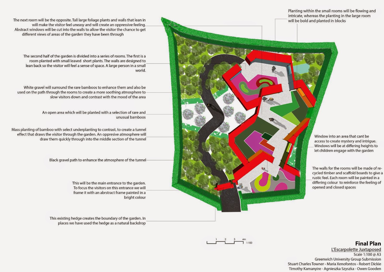
We have been working closely on form and structure of the space along with the quintessential planting combination which we have finally decided on. This can be seen below in the planing plan.
This planting plan brings up up to and over the allotted budget. As a result a garden focusing on recycling and cheap, rough materials has been created. I'm worried we have neglected the hard landscaping side of the garden and it will fail us and not provide a good backdrop for such a fantastic range of planting.

Time will tell and things will be resolved as each section of the design is discussed in further detail.

I am tasked with the costing and am worried that we are set to go over the allotted budget of 11,000e


Chaumont Garden Design Progression

Chaumont Garden Design Progression 

Please see below some sketches illustrating our design ideas prior to the crit last Wednesday. 

These were produced my my group. We have been experimenting and reviewing various aspects of the design and our ethos since the group crit where our design concept changed drastically. 

I feel that its important to keep a record of the evolution and development of the design as it goes through these preliminary stages. 

Me, Tim and Maria all met up to develop and agree the above design and although its changed I have attached the images to one can see a clear timeline of events through the design process.


Friday, 3 October 2014

Chaumont Garden design planting concepts

Chaumont planting concepts:

Please see attached the background planting and the ornamental planting
the background planting is designed to last year-round with minimal maintenance required. The ornamental planting is delightful in different ways throughout the seasons and will be replaced around the year it is on show at Chaumont. This is just designed to give a taste of the principles and idea direction our group is headed in.
Background planting concept (above) 

Ornamental seasonal/interest planting concept (above)
 

Tuesday, 30 September 2014

Sketching practice

Sketching practice:


I badly need to practice my shading and perspective technique when hand sketching and rendering. 

As such I tried to replicate a scene from a garden I previously designed under Charlotte Rowe Limited. It took me 45 minutes to complete and I still have a way to go before it is at Tom Stuart Smith's level. 

Once this course has been completed I may have to outsource fine art; some research suggests that fine art is a massively over saturated industry. Especially if work was to be outsourced into poorer regions of Europe an exquisite pencil vignette drawing costs as little as 65Euros/ A3 sheet. 


Construction and installing a reclaimed fountain:

Construction and installing a reclaimed fountain:


At work we are currently installing a reclaimed fountain. the image above were taken because I was fascinated by complexity of the project. It took some time to source the correct materials and even longer to arrange exactly how I was going to complete the feature for the client within budget and with a high durability and longevity factor. The above images document how we went about constructing the fountain. 

Was a shame to have to use green fibreglass. Next time I will try and source a more organic shade. Aquatic planting/ algae post completion will help to obscure the vibrancy of the colour. Still; happy client, profit, and progress for the fledgling company. 

Example of aesthetically pleasing piece of work from Y2


Second year visual work analysis:


Throughout the second year I felt that one of my weaker areas as a designer included a poor rendering technique. As such I worked to experiment with Sketchup Plug-in programmes, post modelling Photoshop manipulation and importing hand rendered textures.

The above portrays a selection of vignettes that accompanied a design for a RNLI memorial garden.

I feel that the presentation is crisp and uncluttered. It lacks warmth that could be achieved by including in-situ background images and by hand rendering after completing the images on pc.

Another problem with the images is the number of people using the space and how 2d some of the planting looks. Next time I plan not to use the 'face me' function in sketchup but cris-cross the 2d textures to create a smaller more 3d plant. Increasing the number of people using the space would make it feel more used and alive.


Colour swatch printing comparison


Colour comparisons:
Top image 16 colour swabs drawn out on cartridge paper and 60gm tracing paper. 


Bottom image printed out of inkjet printer after having scanned tracing paper and cartridge paper colour swaps into computer at 300dpi. 


Points worth nothing through completion of task:

  1. Always worth cleaning heads if using an inkjet printer. Especially one that is not in regular use.
  2. much easier to paste cartridge  paper onto paper than tracing paper onto paper. problem may be solved with higher weight tracing paper.
  3. Easier to paste printed images into book without fear of smearing that was present with drawn colours.
  4. Lemon yellow comes out much darker after being scanned in
  5. Aqua marine green comes out as a blue hue after being scanned and printed out.